The Power of Swiss Style in Web Design: High-Converting Landing Pages
Discover how Swiss Style (International Typographic Style), famous for its clean grids and sans-serif typography, has become the major trend in modern landing pages to boost conversions.
In this post
- The Origin of Swiss Style: Clarity Above All
- The 4 Practical Pillars of Swiss Design Applied to Digital Media
- 1. The Dynamic Grid System
- 2. Sans-Serif Typographies in the Grotesque Style
- 3. Asymmetric Balance and White Space (Breathing Room)
- 4. Photography with a Clear Narrative Function
- How Less Information Generates More Sales in Practice
- Creating Your Next Swiss Style Landing Page on FlyB.app
- Next Steps: Clearing Away Elements That Cost You Leads
If you have ever felt overwhelmed by noisy web pages packed with flashing banners, overlapping elements, and constant distractions, you are not alone. In a digital ecosystem saturated with visual noise, your website visitors crave a single scarce resource: instant clarity. This is precisely why one of the biggest trends in high-converting landing page design today revives an aesthetic established over seventy years ago: the Swiss Style (or International Typographic Style).
Born in mid-20th century Europe, this revolutionary movement stripped away all superfluous decoration and proved that an absolute focus on content and structure creates the best possible browsing experience. Innovative giants and benchmarks in generative artificial intelligence, such as Anthropic, understood this truth long ago and use this minimalist visual language as the institutional foundation for their communication channels. In marketing, the rules remain the same: a page that is visually easy to scan reduces cognitive fatigue and directly maximizes your number of qualified leads.
The Origin of Swiss Style: Clarity Above All
The Swiss Style—historically known as the International Typographic Style—flourished predominantly in Switzerland during the 1950s. Its foundation stemmed from a radical commitment to objective information and optimal legibility. The core vision was that design should not strive to be self-expression by the author, but rather function perfectly as a neutral, clear, and intelligent conduit for written information.
The obsession with maximum reading neutrality shaped some of today's most imposing and timeless typographic brands. A striking example of this is the birth of the legendary Helvetica typeface in 1957, conceived under the strict ideals of the movement. To this day, the typography continues to be employed across hundreds of corporate logos precisely for its undisputed sense of institutional transparency and ordered sophistication.
The 4 Practical Pillars of Swiss Design Applied to Digital Media
To embody Swiss rigor with excellence on your brand's pages, you need to master the fundamentals of this classic functional structure. These are the indispensable points:
1. The Dynamic Grid System
In classic poster design from the last century, the use of a rigid geometric grid system guided all positioning. In today's dynamic digital environment, the grid defines how your information blocks and button boxes will be logically organized according to the natural proportions of responsive layouts across desktop and mobile screens, creating an extremely polished and trustworthy appearance.
2. Sans-Serif Typographies in the Grotesque Style
The Swiss Style rejects ornamentation that causes optical friction for the end consumer. Clean typefaces from the grotesque/neo-grotesque classification broadly dominate this type of layout. When words are designed in prominent sizes with deliberate alignment and spacing, your product title visually becomes the main centerpiece of your sales funnel.
3. Asymmetric Balance and White Space (Breathing Room)
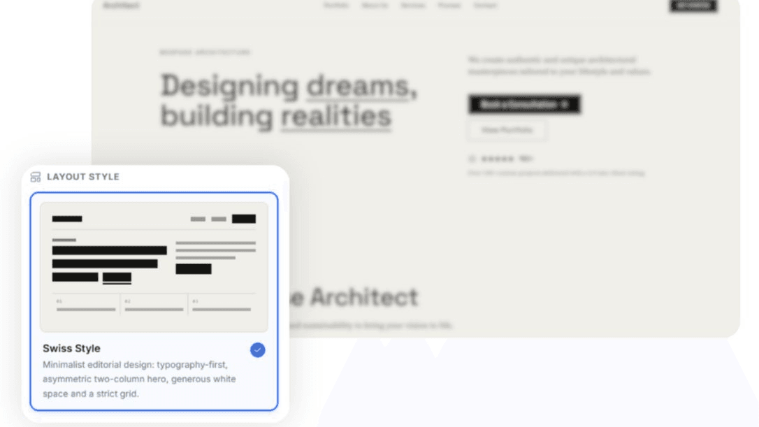
Traditional design persistently seeks a fully centered arrangement purely out of safety. The Swiss Style chooses to harness the power of planned asymmetry. By leveraging contrast between short phrases concentrated in the upper-left corner and expansive areas of open white space on the opposite side, you guarantee absolute user focus right up to the placement of your final CTA (call to action).
4. Photography with a Clear Narrative Function
In contrast to an excess of subjective drawings or flamboyant graphic collages, this standard masterfully utilizes practical photographic dynamism. The purpose of conceptual illustrations or objective images serves a purely communicative role without filters, delivering immediate clarity to those consuming the practical benefits of your digital business.
How Less Information Generates More Sales in Practice
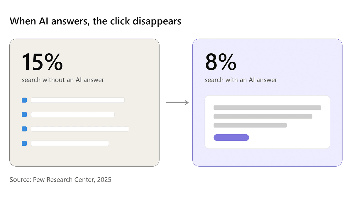
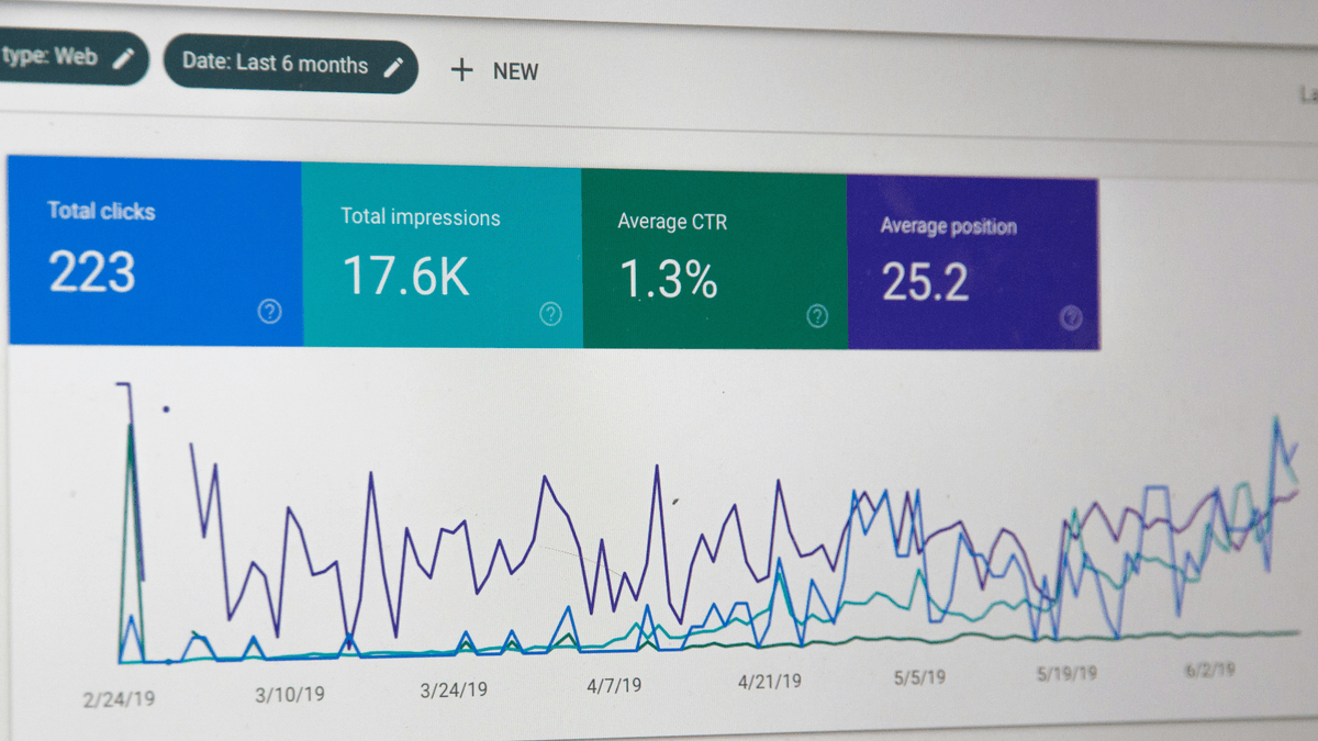
Visitor attention span on websites and profiles lasts mere seconds according to deep performance reports in analytics tools. Visitors must be captured immediately by core arguments.
By opting for the direct advantages that European-inspired minimalist aesthetic and distribution offer to businesses focused on end-user experience, we can clearly see the distinct advantages:
| Traditional Funnel Challenge | Swiss Style-Based Solution |
|---|---|
| Low attention span and high instant bounce rate | Monumental headlines draw primary attention to the core benefit in under 1 second |
| Structural slowness in mobile page load times | Lean assets and lightweight code based purely on text alignment |
| Mental fatigue when searching for key links across sections | Fewer options on screen ensure quick clicks directly toward goal conversion |
Reducing and reorganizing the spatial and textual proportions of your campaign spares technical teams from heavy technical burdens when striving for mobile user retention.
"In today's landscape of constant feed noise and notifications, whoever possesses the visual courage to open up free space in design focuses all light exclusively on the user's core desires and leads conversions."
Creating Your Next Swiss Style Landing Page on FlyB.app
Until recently, planning a clean layout with such sophistication and balanced spatial distribution across vertical pixel grids from scratch required developers to perform complex, manual styling maneuvers to balance sizes across different monitor dimensions and modern computer resolutions.
The marvelous advantage now is the fusion of these classic usability traditions applied to the convenience of assistants and features developed for modern professional marketing automation.
In the AI Page Builder by FlyB.app, you have full control over designing structured layouts perfectly based on the aesthetic rules of the famous International School of Design and Swiss precision for delivering direct-to-consumer content. Elements come fully organized with robust typography, generous spacing, and excellent contrast through the efficient use of integrated Artificial Intelligence applied to the campaign layout.
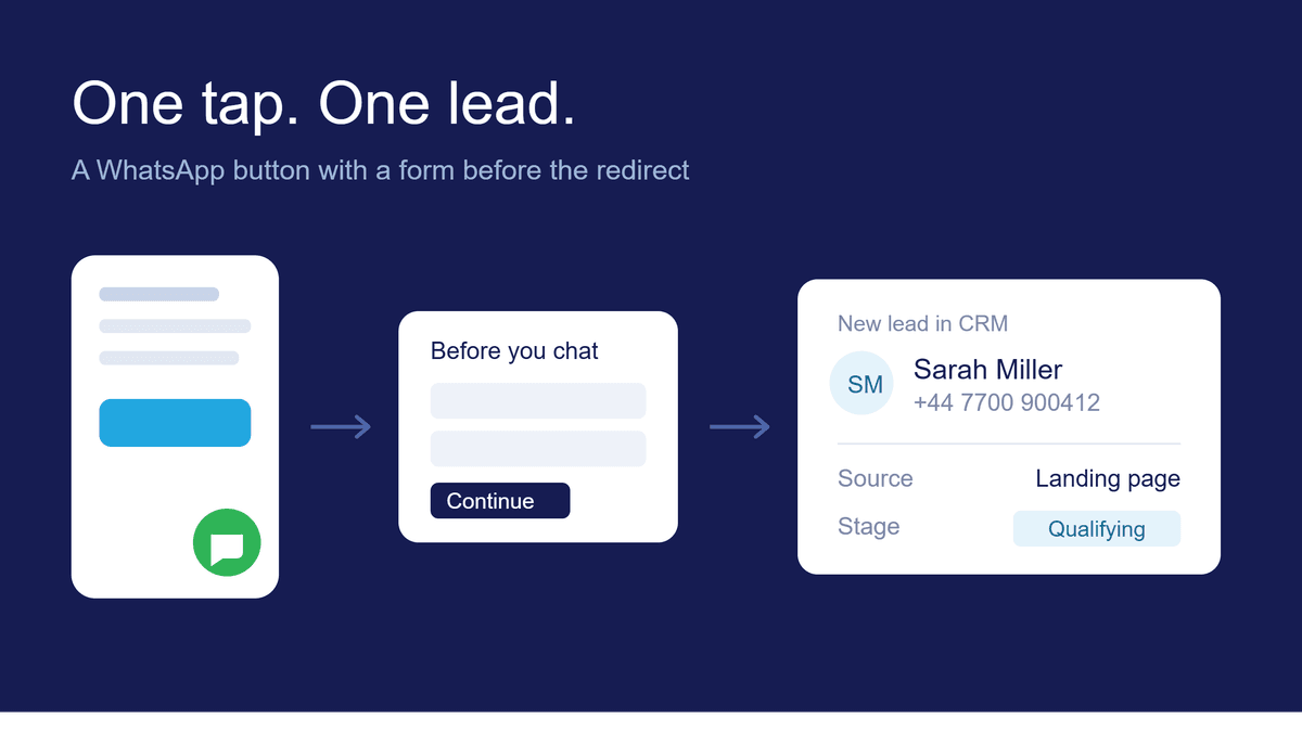
The integrated AI creates perfectly dimensioned pages where everything is mathematically organized for the end customer: explanatory lists remain clean, and every captured lead goes straight to the integrated CRM for corporate support behind your technical funnel stages. There are no complex manual extension installations required to capture active lead interactions within agency workflows.
Next Steps: Clearing Away Elements That Cost You Leads
Before committing your next heavy capital investment toward structuring or performing complex conceptual overhauls to adjust hundreds of product information blocks, bet your primary tactical chips on the irresistible beauty that only maximum sophistication in the Swiss graphic design standard can translate and implement for your next modern online business interfaces.
Your traffic, active digital campaigns, and your entire support setup equipped with automated tools will yield far greater returns. Create efficient new experiences and test your variants today using fantastic templates directly inside the native intelligent builder at FlyB.app.